“Good design is a minimal design”
Dear Designers,
“You are a designer, right? then add more details”
“It just looks plain, add more colors please” ……………………………………[We all have heard this.]
For me, the definition of design is, A design is something which solves the problem in a creative way and makes efficient outcome for its user. Even if it’s not solving a problem, a design should excite a person to look at it.
Let’s look at this design;
let’s start with Bad Design;
1. B.E.S.T. BUS
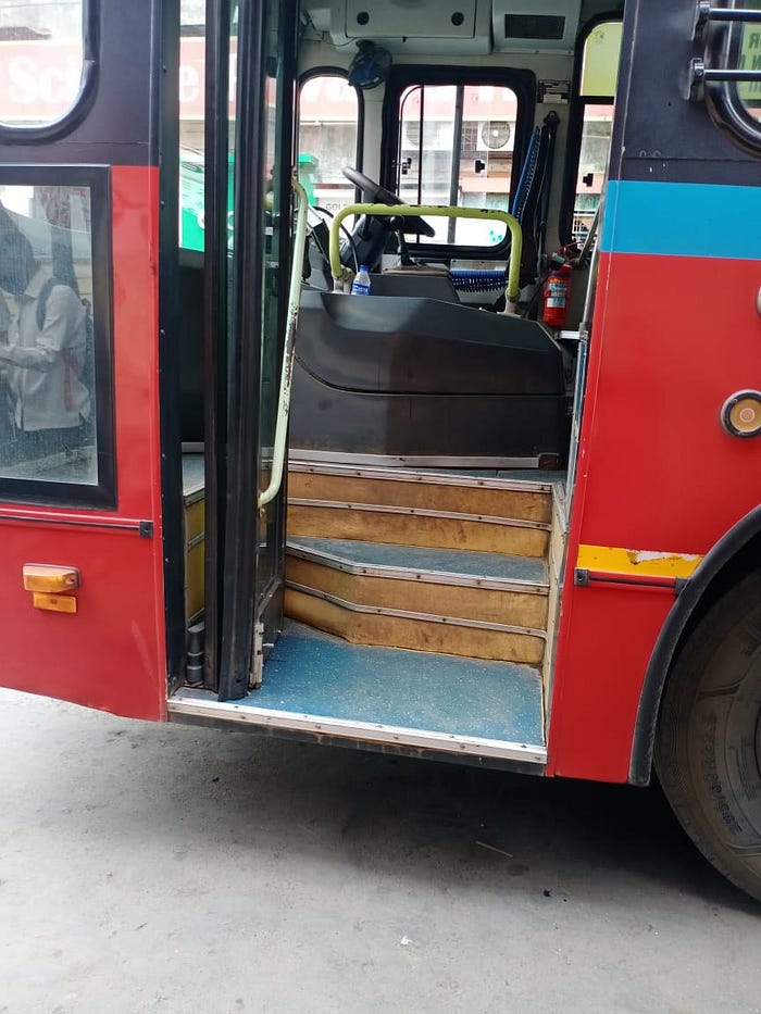
According to the image it looks spacious but it's not convenient or efficient for passengers, the height of stairs, the handle to hold, it might be easy for any younger age group but for the older age group definitely not and yeah average age group who travels daily by bus is of passenger around 40–50 also younger age group rarely choose to travel by bus as they give their preference more to two-wheeler or Local Train, it’s my personal observation that even people with a disability faces problem during boarding, Hence it’s a bad design.
2. A wooden table
Does this excite you to use it? this is made with considering users efficiency for use this table, very comfortable to spread the legs and relax while working on laptop and enhance more productivity due to low back pain issues, Hence it’s a good design.

3. Status Bar/ Notification Bar Icon

Bad Design
Is it giving notification of space is running out or is it telling us your money is full in the pocket ??
The first time after a long I saw this status bar icon and took two minutes to understand what exactly this is trying to notify me.

How does this belong to storage or space ?? according to Dieter Rams one of the ten design principles;
“Good Design is unobtrusive”
a product needs to fulfill its purpose and convey the right message to the user in the right way.
Bad Design;
4. A rotating holder Tap
The holder of this Tap always confuses a user to understand that how many times one will have to rotate to get water from it in right force.

Good Design;
5. A two-way rotating Tap
One can easily understand that only a little force can help it to get water from it in whatever force they want, even a kid can use it efficiently. A user will always find a product that gives a smooth user experience.

Bad design of course;
6. PVC Wall valve
To open and close has only one arrow which is difficult to understand, which means for two actions has just one navigation used, one will have to experiment with it by rotating it to understand its right usage.
it is very confusing for a user to understand it. one of the Ten principles for good design is: “Good design makes a product useful and also understandable.”

Good Design Again;
7. Bicycle mount holder for mobile
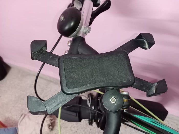
My first-time experience of settling up this holder was really good and gave me some learnings how minimally one can express its user manual and set up by my own instead of requirement of any mechanic. I looked at this twice the way it is designed, Great !!

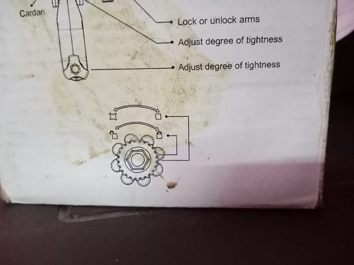
They have also provided a user manual on its box, but it didn’t require looking at the manual.
8. Aqua Marina Body Wash
A Good design from UI & UX perspective.
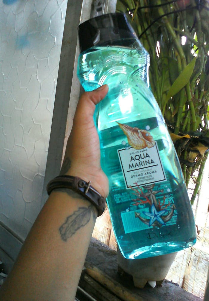
The designer not only has worked upon its design but also usability and tried to give an overall feel of aquamarine, for which the product has been made. Many time (almost every time) we see the packaging and mentioned details are the only thing gives brief about the company and its product but here look how simply the designer tried to make it user friendly and trust me it smells good. [and am aqua kid]
9. Duolingo Application
“Very Good User Experience designed”
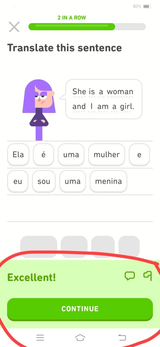
I Am a fan of the Duolingo App, one of the smoothest apps to be experienced,
here in the above picture, showing that, even after the user has given the answer right, the app is allowing its user to go through the sentences once whatever they have done right, many times it happens that user gives the correct answer just because those words get fit in their subconscious mind like a play button and they keep on giving correct answers automatedly, this is my personal experience, one day I realized that why do i have to click again on the continue button after correct answer, so this is my observation on user behavioral.
Also, especially in a learning app, while one side a user is a learner, the designer has tried focusing on encouragement to learn more by praising them on the comment [i.e: Excellent, you’re doing well keep going]
Which encourages a user to do more.